
Tuesday, 5 November 2013
Sunday, 27 October 2013

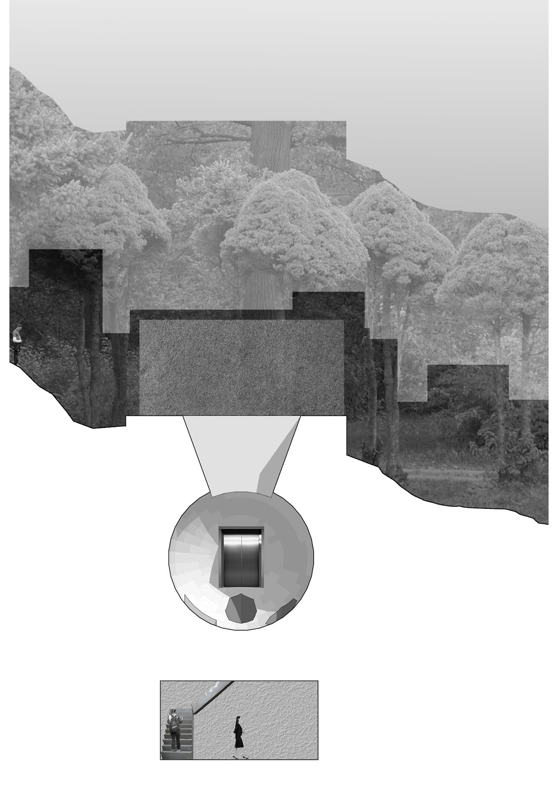
Working on Section

Finally finished with the section where the exterior is very boring and the interior very colourful.
Illustrator
I had to take the model out of rhino and to put it in illustrator to make it convey my idea better. This was difficult as I have never used illustrator before and I was struggling with most of what I had to do.


I decided to make the section partially perspective to make it more interesting.
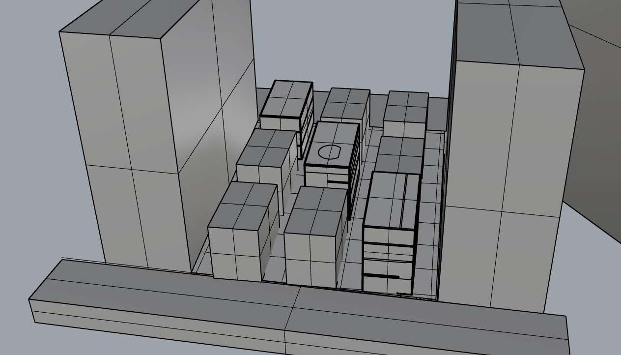
Models for interior public spaces

This was the texture of the walls which make it more fun.

The weird looking shapes that act as chairs and decorations for the public spaces.
First Crit for new stage

Working towards the final


We then had to model some of these on rhino. We had just learned how to use rhino and I thought that it was a lot better then Archicad because of its flexibility.
Friday, 20 September 2013
Crit on the house
I was given great feedback during my crit about the pros and cons about the design of my house. I was told to change the figure on my chair that I had designed because it had given the wrong connotations. They told me that my theme was a basic facade, with an unusual/bizarre interior.
 |
| My work is on the left. |
Overall I had gotten a lot out of the crit that was held today. In general:
-Stop using standards (straight floors and straight walls), unless your going for the standard approach
-Should show the context (where your house is in the site plan)
-Make use of the roof as it is another floor
-Can use sims to show your design
-Plaster casts allow random and radical ideas which you can implement in your design
-Architecture is like a service where you have to consider the people
-Different floors could be completely different things (different fantasies on each floor)
-Every building needs a theme that you follow (allows everything you do to have a reason)
-Public and private spaces are important and not only the bottom floor can be public but the middle can be while the bottom and top floor being private
-Don't waste space and occupy all of the area that you are given with things such as courtyards and gardens etc.
-Good idea: using the threshold we designed to distribute goods
-Whenever you do a 3D model on the computer, its compulsory to section it
-All sections must have a grounding
-Can try to have vertical pancake instead of horizontal (pancake meaning stacked on top of another)
At the end of the crit we were told to look at Maison À Bordeaux, France, Bordeaux


Thursday, 19 September 2013
After the Site Analysis
After the site analysis we had to design a house on the parking lot we had to investigate. The dimensions we were given are 11x7 x 8high. For our designs we had to incorporate the last 5 rounds into the building. The first floor consists of a tunnel through the building (Round 2) which splits it into a gashapon shop (Round 4) and a bar. Second level I put the chair I designed (Round 1) in the living room and having the dining room open to a courtyard space in the middle (Round 5). The courtyard space is open to the roof which allows light and fresh air in. On the final floor there is a luxurious bathroom and the bedroom that the person will live in.


Monday, 16 September 2013
Stage Two Round One
For this round we had to make a map (analyzing the site) with our given topics: Objects, Thresholds Surfaces, Programmes, Volumes and Openings.
I was given thresholds to do and so I visited the site and went through 5 thresholds recording all the details (before, within and after the threshold).

Wednesday, 28 August 2013
Designing Opportunity
I'm really starting to understand and enjoy the briefs that are given each week.
My thoughts so far: At first I didn't really understand the meaning behind each rounds in stage one until the end where I realised that it challenges you to work out of your comfort zone as well as within. Throughout each round I always challenged myself to work out of my comfort zone by making models first and then drawing after, because I'm more used to planning out my work before I start to turn that idea into a model. As stated in the crit, I still unconsciously ended up following an organised way of doing things despite going out of my comfort zone. It has been a really fun experience so far - self reflecting throughout each round and discovering your own way of working. I definitely did not regret choosing this as my paper in the beginning of the semester and I give props to the tutors Gerard and Frances for creating such an amazing paper/idea. At the beginning of each rounds I was quite lost into how to start because it was so vague and so I trusted my gut feeling to do things, and eventually I started to enjoy each round near the end.
Still quite confused and scared about what is to come in the second stage.
Crit
Mid Semester Crit
The mid semester crit where we showcase all of our work that we've done throughout the semester.


My crit went really well and I had also learned a lot from other people's crits.
Important Points:
Model can be used for more - drawings
Thinking about different axis's, don't restrict yourself to flat architecture, think about vertical
Doing exact model and drawing could be profitable because usually model changes the original drawing idea if you can't control it.
Always question your work, ask why you did these things and how you could make it better (putting it upside down)
Naming your work usually represents what it is.
Combine different models to create a new one (section models combining them)
Do a lot of diagrams as it is the best way to convey your work.
Collage in real life - cutting out real people from magazines
Don't let project constrain you - square model controls the way you think as cylinder and triangles break away from their form.
GIF your work - taking a photo of the work every hour and turn it into a GIF to see the process
Freeform - making a lot of models first then coming up with ideas after'
Photocopy models or scan models
Find holes in brief to exploit
Should I continue to try to adapt to new ways to approach things? Or should I stick to the way I do things - precise, thought through, clean and specific.
Tuesday, 27 August 2013
Final Crit for Final Round in Stage One
 |
| Photos of the 10 models playing with light |
 |
| Modeling it on Archicad |


Unfortunately I interpreted this brief wrongly and made a mistake of putting the models into context. We were meant to focus on portraying the space with the lights and to emphasize the qualities from the photos taken using the lights.
Friday, 23 August 2013
Final Round : Stage One
Opening/Volume
For this week we had to plaster cast a sectional of volumes and openings with a limited (maximum) size of 70 x 70 x 120. We got the chance to pull out of a bag to decide the shape of our mold: cylinder, pyramid or rectangle. I managed to pull out rectangle which is supposedly the easiest and so we need to put more effort into the volume and opening. This week we were required to have 10 plaster casts by Friday.
 |
| I had to drill some holes in some of the models to allow light in |
Tuesday, 20 August 2013
Round Four Crit
I managed to do an oblique perspective drawing of my completed idea for the shop/house. Most of the furniture are multifunction where I had a couch that would fold out to be a bed, a TV cupboard, a shower bath and a bed which folds up and becomes a workspace for the living person.
 |
| 1:20 At first they thought the gashapon machines were washing machines, those |
 |
| 1:20 The sectional drawing didn't show the information I intended to portray, making it a weak drawing. |
The feedback that I was given was that I needed people to represent what was happening inside the house and shop as well as captions/annotations to show the functions of the house. The house had a wall in the middle of the shop and house where it can be slided to make the shop bigger during the day and the room bigger during night. An idea that was suggested was to completely open the shop to the public and have a row of gashapon machines on the wall where during the day, the user can completely push out the wall to have the whole area for living. The wall then becomes a shop at night for people that walk by the shop.
General feedback that was given was that the entrance into the shop/house was also important that also needed to be considered.
Friday, 16 August 2013
Stage One Round Four
Tight Fit / Constraint
For this weeks challenge we were to design a shop and a house within a given space. The space is determined by which parameter you pick out of a hat, where you are given two blocks each measuring 6000(L) x 3000(W) x 3000(H)mm. The parameters were two long, two wide, one on top of another, I had picked out two wide, which gives me the space of 6000(L) x 6000(W) x 3000(H)mm. I also flipped a coin for the choices of pencil or pen (we are only allowed to use one throughout the challenge), I managed to get tails which was pen. We had to experiment with different line weights using the Pen, and the drawings all had to be oblique drawings throughout the process. An oblique drawing is a drawing where the face is 2-D and you project lines at an angle giving true values for all edges.
 |
| Oblique Drawing done at 45° |
Having to work around the restrictions it was really difficult at first for me to adapt to. Eventually I worked around it where I managed to draw a plan drawing of the house as an oblique drawing. I decided that the shop was going to sell toys from Gashapon Machines.

Tuesday, 13 August 2013
Crit for Round Three
Unfortunately I had only a range of explorations of models and didn't have final drawings of diagrams for the proposed surfaces of internal and external.
Friday, 9 August 2013
Round Three of the Challenges
For this week's challenge we have to design a internal surface and an external surface. The internal surface focuses on the haptic and tactile quality of surface, while the external surface is to focus on the manipulation of water.
The parameters were determined from a game of "Jankenpon" which was Rock-Paper-Scissors in Japanese. I managed to win the challenge and I chose horizontal/oblique as the internal and vertical/oblique as external. Horizontal oblique meaning not completely horizontal but had to be at an angle no more than 45 degrees and vertical oblique meaning not completely vertical but had to be at an angle of no less than 45. We had a choice of what to make the textures from, but we were given a list as examples: Timber, plaster cast, vacuum former, jelly, plasticine.
I first started off by gathering a numerous amount of random textures which would be the mold for the plaster cast. I casted fabric, patterns made by plastercine as well as patterns made from wood. From the readings I had extracted from it "terrains, structured for conducting body-wide conversations with whoever moves...", interpreting that I tried to think about the hierarchy of people where the higher in the family tree line the higher you would stand to speak. It didn't really turn out well and so I just went on with what I had made combining multiple surfaces together.


Monday, 5 August 2013
Final GIF
This is the threshold of going through the tunnel from one side to the other.
I wanted to make the final GIF that shows the process of the peaks and troughs, going up and down. Unfortunately I ran out of time after attempting to make the last GIF less choppy. The stationary object at the bottom of the GIF is meant to be the front wheel of the bike.
.gif)
I wanted to make the final GIF that shows the process of the peaks and troughs, going up and down. Unfortunately I ran out of time after attempting to make the last GIF less choppy. The stationary object at the bottom of the GIF is meant to be the front wheel of the bike.
.gif)
Sunday, 4 August 2013

Saturday, 3 August 2013
First attempt at the GIF
For this weeks challenge the topic is "Threshold" (Threshold: The piece of timber or stone which lies below the bottom of a door. and has to be crossed in entering a house; the sill of a doorway; hence, the entrance to a house or building.)
Basically the experience of change from passing from one place to another. For the chance game, there were 4 options of:
Small<->Large, Up<->Down
On Bike, On Foot
Ivory Board, Plaster Cast (Blue Foam, Polystyrene)
Computer Generated Model, Digital Collage
I decided to have all my options as white and I was given, Up<->Down, On Bike, Ivory Board and Digital Collage. From the Up<->Down process, the first thing that came to mind was how life has it's ups and downs, how there are troughs and peaks in life and the hardship to climb to the peak. Therefore I wanted a threshold that incorporated both up and down. My concept was basically a tunnel through a mountain, where one side is a very natural and beautiful environment with green lands covering the floors and the other side a busy city life. Both sides are a progression in life where the air gets better in the natural environment where the city life is more industrial and modern.
I made the GIF file frame by frame which was a nuisance to make.

Friday, 2 August 2013
First Crit of the Semester

1:1 model of my chair. The feedback I got was that I could've added more detail and to show what the material is. The benefit of a 1:1 model is that you can easily show detail where I could've shown that the strings are chains. Another thing was to have a section of the model showing the mechanics of the chair of how it folds.

Wednesday, 31 July 2013
First Chance Game "Designing Opportunity"
The first chance game in my design group "Designing Opportunity" we had to draw out of a bag to decide whether we are making a chair that is; stackable, foldable or a table chair. After that we rolled a dice that decided how many elements/legs would touch the floor which includes 0, 1, 2, 3, 5, 6. Finally everyone had to flip two coins to decide what materials they would be using. I drew out foldable, rolled a 0, flipped a heads and tails which got me Grey Mount Board and Plasticine.


My 17 pages of 140x140 that explored my chair.


My 17 pages of 140x140 that explored my chair.
Friday, 31 May 2013


Subscribe to:
Posts (Atom)