Sunday, 27 October 2013

Illustrator

I had to take the model out of rhino and to put it in illustrator to make it convey my idea better. This was difficult as I have never used illustrator before and I was struggling with most of what I had to do.
I decided to make the section partially perspective to make it more interesting.

Models for interior public spaces

This was the texture of the walls which make it more fun.

The weird looking shapes that act as chairs and decorations for the public spaces.

First Crit for new stage

After progressing from the last check point with the foam I had decided to have my buildings all having the same facade making it very basic with a very radical interior.

I took screen shots of the model and drawn on top of them showing my ideas. I had a crit in which I had a lot to change afterwards.

Working towards the final


We had to make 3 foam models that showed, Outward, Inward and Permeable(pass through). These models had to be 1:100, but instead I decided to make the models 1:200 and made more then 3 which explored the 3, outward, inward and permeable.

We then had to model some of these on rhino. We had just learned how to use rhino and I thought that it was a lot better then Archicad because of its flexibility.

Friday, 20 September 2013

Crit on the house

I was given great feedback during my crit about the pros and cons about the design of my house. I was told to change the figure on my chair that I had designed because it had given the wrong connotations. They told me that my theme was a basic facade, with an unusual/bizarre interior.

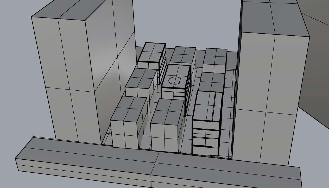
My work is on the left.

Overall I had gotten a lot out of the crit that was held today. In general:
-Stop using standards (straight floors and straight walls), unless your going for the standard approach
-Should show the context (where your house is in the site plan)
-Make use of the roof as it is another floor
-Can use sims to show your design
-Plaster casts allow random and radical ideas which you can implement in your design
-Architecture is like a service where you have to consider the people
-Different floors could be completely different things (different fantasies on each floor)
-Every building needs a theme that you follow (allows everything you do to have a reason)
-Public and private spaces are important and not only the bottom floor can be public but the middle can be while the bottom and top floor being private
-Don't waste space and occupy all of the area that you are given with things such as courtyards and gardens etc.
-Good idea: using the threshold we designed to distribute goods
-Whenever you do a 3D model on the computer, its compulsory to section it
-All sections must have a grounding
-Can try to have vertical pancake instead of horizontal (pancake meaning stacked on top of another)

At the end of the crit we were told to look at Maison À Bordeaux, France, Bordeaux

Thursday, 19 September 2013

After the Site Analysis

After the site analysis we had to design a house on the parking lot we had to investigate. The dimensions we were given are 11x7 x 8high. For our designs we had to incorporate the last 5 rounds into the building. The first floor consists of a tunnel through the building (Round 2) which splits it into a gashapon shop (Round 4) and a bar. Second level I put the chair I designed (Round 1) in the living room and having the dining room open to a courtyard space in the middle (Round 5). The courtyard space is open to the roof which allows light and fresh air in. On the final floor there is a luxurious bathroom and the bedroom that the person will live in.


Monday, 16 September 2013

Stage Two Round One

For this round we had to make a map (analyzing the site) with our given topics: Objects, Thresholds Surfaces, Programmes, Volumes and Openings.

I was given thresholds to do and so I visited the site and went through 5 thresholds recording all the details (before, within and after the threshold).